/* SCROLLOFF — CONTENU PRINCIPAL */
#so-main {
--purple: #6842FF;
--light: #7F5AFF;
--mint: #12EDB7;
--ink: #211657;
--cream: #F8F6FF;
font-family: inherit;
color: var(--ink);
overflow: hidden;
background: #fff;
}
#so-main * { box-sizing: border-box; }
#so-main .wrap { width: min(1120px, 90%); margin: auto; }
#so-main .hero {
background: var(--purple);
color: white;
border-radius: 28px;
overflow: hidden;
}
#so-main .hero-grid {
display: grid;
grid-template-columns: 1fr 1fr;
align-items: center;
gap: 48px;
padding: 65px 7%;
}
#so-main .kicker {
display: inline-block;
padding: 8px 13px;
border: 1px solid rgba(255,255,255,.45);
border-radius: 100px;
font-size: 12px;
font-weight: 850;
letter-spacing: 1px;
}
#so-main h1 {
color: white;
font-size: clamp(46px, 5.5vw, 76px);
line-height: .98;
letter-spacing: -3px;
font-weight: 950;
margin: 24px 0;
}
#so-main h1 em { color: var(--mint); font-style: normal; }
#so-main .hero-copy {
color: #F0EBFF;
font-size: 17px;
line-height: 1.75;
max-width: 450px;
}
#so-main .actions {
display: flex;
flex-wrap: wrap;
gap: 12px;
margin-top: 26px;
}
#so-main .btn {
display: inline-flex;
align-items: center;
justify-content: center;
padding: 15px 21px;
border-radius: 14px;
font-size: 14px;
font-weight: 900;
text-decoration: none;
transition: transform .2s;
}
#so-main .btn:hover { transform: translateY(-3px); }
#so-main .btn-mint { background: var(--mint); color: var(--ink); }
#so-main .btn-white { background: white; color: var(--ink); }
#so-main .note { font-size: 12px; color: #E7DFFF; margin-top: 17px; }
/* TELEPHONE */
#so-main .phone-stage {
min-width: 0;
min-height: 500px;
display: flex;
align-items: center;
justify-content: center;
position: relative;
isolation: isolate;
}
#so-main .phone-glow {
position: absolute;
z-index: -1;
width: 340px;
height: 340px;
border-radius: 50%;
background: var(--light);
border: 2px dashed rgba(255,255,255,.5);
}
#so-main .phone {
position: relative;
width: min(280px, 78%);
padding: 8px;
border-radius: 39px;
background: #19152C;
border: 2px solid #C7BAFF;
box-shadow:
0 0 0 3px rgba(255,255,255,.15),
0 28px 65px rgba(24,12,73,.4);
transform: rotate(2deg);
}
#so-main .phone-screen {
width: 100%;
aspect-ratio: 832 / 1792;
overflow: hidden;
border-radius: 29px;
background: var(--purple);
position: relative;
}
#so-main .phone-screen img {
display: block;
width: 100%;
height: 100%;
object-fit: contain;
object-position: center top;
border-radius: inherit;
}
#so-main .phone-island {
position: absolute;
top: 9px;
left: 50%;
transform: translateX(-50%);
width: 27%;
height: 15px;
background: #19152C;
border-radius: 20px;
z-index: 2;
pointer-events: none;
}
/* SECTIONS */
#so-main .section { padding: 85px 0; }
#so-main .center { text-align: center; }
#so-main .eyebrow {
color: var(--purple);
font-size: 12px;
font-weight: 900;
letter-spacing: 1.7px;
text-transform: uppercase;
}
#so-main h2 {
font-size: clamp(34px, 4vw, 52px);
line-height: 1.08;
letter-spacing: -2px;
font-weight: 950;
color: var(--ink);
margin: 15px 0 20px;
}
#so-main .lead {
max-width: 670px;
margin: auto;
font-size: 17px;
line-height: 1.8;
color: #615A7F;
}
#so-main .concept {
display: grid;
grid-template-columns: 1fr 1fr;
align-items: center;
gap: 45px;
padding: 45px;
border-radius: 28px;
background: var(--cream);
}
#so-main .mascot {
background: var(--purple);
border-radius: 24px;
min-height: 320px;
display: flex;
align-items: center;
justify-content: center;
position: relative;
overflow: hidden;
}
#so-main .mascot:before {
content: "";
position: absolute;
width: 240px;
height: 240px;
border: 3px solid var(--mint);
border-radius: 50%;
}
#so-main .mascot img {
display: block;
position: relative;
z-index: 1;
width: 82%;
max-height: 300px;
object-fit: contain;
}
#so-main .mascot-emoji {
position: relative;
font-size: 100px;
}
#so-main .concept p {
color: #615A7F;
line-height: 1.8;
font-size: 16px;
}
#so-main .tag {
display: inline-block;
background: #D9FFF4;
color: #155E50;
padding: 10px 14px;
border-radius: 50px;
font-size: 12px;
font-weight: 900;
}
#so-main .cards {
display: grid;
grid-template-columns: repeat(4,1fr);
gap: 16px;
margin-top: 40px;
text-align: left;
}
#so-main .card {
padding: 23px 19px;
min-height: 215px;
border: 1px solid #EAE5FF;
border-radius: 21px;
background: white;
transition: transform .2s;
}
#so-main .card:hover { transform: translateY(-5px); }
#so-main .card:nth-child(2) { background: #E9E3FF; }
#so-main .card:nth-child(3) { background: #D9FFF4; }
#so-main .card:nth-child(4) { background: #FFF0E9; }
#so-main .card-icon {
font-size: 29px;
display: block;
margin-bottom: 20px;
}
#so-main .card h3 {
color: var(--ink);
font-size: 17px;
line-height: 1.3;
margin: 0 0 10px;
}
#so-main .card p {
color: #615A7F;
font-size: 14px;
line-height: 1.7;
margin: 0;
}
/* RECOMPENSES */
#so-main .rewards {
background: var(--purple);
color: white;
padding: 60px 7%;
border-radius: 28px;
}
#so-main .rewards h2 { color: white; }
#so-main .rewards .lead { color: #EAE4FF; }
#so-main .steps {
display: grid;
grid-template-columns: repeat(3,1fr);
gap: 17px;
margin-top: 38px;
}
#so-main .step {
background: rgba(255,255,255,.09);
border: 1px solid rgba(255,255,255,.25);
border-radius: 20px;
padding: 23px;
}
#so-main .step-number {
width: 40px;
height: 40px;
display: flex;
align-items: center;
justify-content: center;
background: var(--mint);
border-radius: 13px;
color: var(--ink);
font-weight: 950;
margin-bottom: 18px;
}
#so-main .step h3 {
color: white;
margin: 0 0 10px;
font-size: 18px;
}
#so-main .step p {
color: #EAE4FF;
font-size: 14px;
line-height: 1.7;
margin: 0;
}
#so-main .brands {
display: flex;
justify-content: center;
flex-wrap: wrap;
gap: 10px;
margin-top: 28px;
}
#so-main .brand {
background: white;
color: var(--ink);
border-radius: 11px;
padding: 11px 15px;
font-weight: 900;
font-size: 13px;
}
/* MODE OFF */
#so-main .premium {
display: grid;
grid-template-columns: 1fr 1fr;
gap: 35px;
align-items: center;
}
#so-main .premium-panel {
background: #FBFAFF;
border: 2px solid #E8E1FF;
padding: 28px;
border-radius: 24px;
}
#so-main .premium-panel h3 {
font-size: 23px;
color: var(--ink);
}
#so-main .price {
font-size: 34px;
font-weight: 950;
color: var(--purple);
}
#so-main .checklist {
padding-left: 0;
list-style: none;
}
#so-main .checklist li {
padding: 12px 0;
border-bottom: 1px solid #E8E1FF;
}
/* FAQ ET CTA */
#so-main .faq {
max-width: 780px;
margin: 35px auto 0;
text-align: left;
}
#so-main .faq details {
border-bottom: 1px solid #E8E1FF;
padding: 20px 0;
}
#so-main .faq summary {
cursor: pointer;
font-weight: 850;
color: var(--ink);
}
#so-main .faq details p {
color: #615A7F;
line-height: 1.7;
}
#so-main .final {
background: var(--mint);
border-radius: 28px;
padding: 55px 22px;
text-align: center;
}
#so-main .final h2 { margin-top: 0; }
#so-main .final p {
color: #3B3266;
line-height: 1.7;
}
#so-main .fineprint {
font-size: 12px;
color: #756E91;
margin-top: 18px;
}
/* RESPONSIVE */
@media (max-width:850px) {
#so-main .hero-grid {
grid-template-columns: 1fr;
text-align: center;
gap: 10px;
padding: 48px 7% 25px;
}
#so-main .hero-copy { margin: auto; }
#so-main .actions { justify-content: center; }
#so-main .phone-stage { min-height: 420px; }
#so-main .concept,
#so-main .premium { grid-template-columns: 1fr; }
#so-main .cards { grid-template-columns: repeat(2,1fr); }
#so-main .steps { grid-template-columns: 1fr; }
}
@media (max-width:480px) {
#so-main .wrap { width: 92%; }
#so-main .hero { border-radius: 20px; }
#so-main .hero-grid { padding: 40px 6% 20px; }
#so-main h1 { font-size: 47px; letter-spacing: -2px; }
#so-main .hero-copy { font-size: 15px; }
#so-main .phone-stage { min-height: 360px; }
#so-main .phone { width: 245px; max-width: 75%; }
#so-main .phone-glow { width: 260px; height: 260px; }
#so-main .section { padding: 60px 0; }
#so-main .concept { padding: 19px; gap: 25px; }
#so-main .mascot { min-height: 250px; }
#so-main .cards { gap: 10px; }
#so-main .card {
padding: 16px 13px;
min-height: 205px;
}
#so-main .card h3 { font-size: 15px; }
#so-main .card p { font-size: 13px; }
#so-main .rewards { padding: 42px 6%; }
#so-main .premium-panel { padding: 21px; }
}
@media (prefers-reduced-motion:reduce) {
#so-main *,
#so-main *:before {
transition: none !important;
}
}
✦ L'APPLICATION ANTI-SCROLL
Assez
scrollé.
Vis pour de vrai.
Reprends le contrôle de ton temps d'écran.
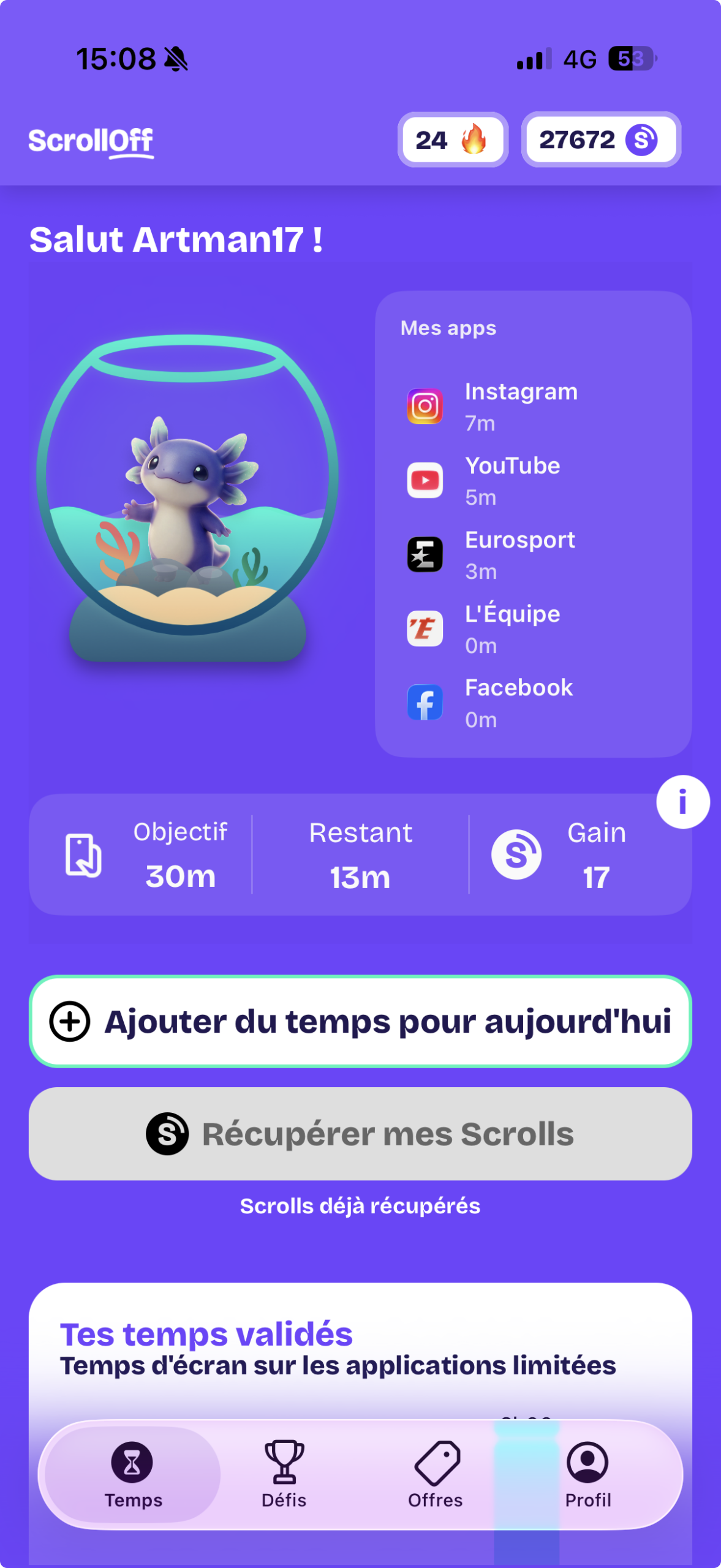
Prends soin de ton axolotl, relève des défis
et gagne des récompenses en lâchant ton téléphone.
Gratuit au téléchargement · À ton rythme
TON NOUVEAU COMPAGNON
Ton axolotl compte sur toi.
Plus tu scrolles sur tes applications limitées,
plus son aquarium se vide. Pose ton téléphone :
il se recharge. À toi de trouver le bon équilibre !
💧 Moins d'écran, plus de vie
À TOI DE JOUER
Un défi par jour.
À toi de choisir.
Bloque les applications qui te distraient au bon moment.
Relève tes défis et gagne des Scrolls en reprenant
le contrôle de ta journée.
🌅
Morning Routine
Pas d'applis au réveil. Commence sereinement.
🎯
Aprèm Productive
Reste concentré sur ce qui compte vraiment.
🌙
Soirée Détente
Déconnecte le soir et retrouve des nuits sereines.
🛑
Anti Scroll
Casse le scroll infini avec des pauses choisies.
TES EFFORTS ONT DE LA VALEUR
Tes efforts deviennent
des cadeaux.
Relève tes défis, cumule des Scrolls et échange-les
contre des cartes-cadeaux proposées dans l'application.
01
Relève ton défi
Respecte ton objectif et libère du temps pour toi.
02
Gagne des Scrolls
Chaque défi réussi te rapproche de ta récompense.
03
Fais-toi plaisir
Découvre les cartes-cadeaux disponibles dans l'app.
Amazon
Fnac
Zalando
Adidas
Spotify
Steam
Deliveroo
Et bien d'autres
Enseignes et récompenses selon les offres disponibles dans l'application.
ENVIE D'ALLER PLUS LOIN ?
Pour ceux qui veulent vraiment décrocher.
Avec le Mode Off, personnalise davantage tes défis
et adapte Scrolloff à ton quotidien.
MODE OFF
Ta concentration, tes règles.
4,99 € / mois
- ✓ Défis quotidiens illimités
- ✓ Applications illimitées par défi
- ✓ Jusqu'à 5 applications suivies
- ✓ Horaires et jours personnalisables
Découvrir le Mode Off ↗
Vérifie les conditions et fonctionnalités actuelles dans l'app.
TU TE POSES DES QUESTIONS ?
On t'explique tout.
Scrolloff, c'est quoi exactement ?
Une application qui t'aide à mieux gérer ton temps sur certaines applications grâce à des objectifs et des défis.
Comment fonctionne l'axolotl ?
Son aquarium reflète ton usage des applications suivies. Plus tu scrolles, plus le niveau d'eau baisse ; lorsque tu poses ton téléphone, il peut se recharger.
Est-ce que l'application est gratuite ?
Scrolloff est gratuit au téléchargement. Le Mode Off propose des fonctionnalités premium supplémentaires.
Comment gagner des récompenses ?
Relève tes défis pour gagner des Scrolls, puis consulte les récompenses disponibles dans l'application.
Moins de scroll.
Plus de vie.
Pose ton téléphone. Profite du moment. Ton axolotl te dira merci.